Lifting Rewards-Application Conversion Through A/B Testing Across Singapore & Hong Kong

relative Lead-to-App uplift in SingSaver (19.91% → 24.51%)
Lead-to-App in MoneyHero HK, up from 12.34%
The MoneyHero rewards journey was leaking qualified users between capturing them as a lead and successfully submitting an application. I led optimisation redesigns of the rewards form and tested them against a live control in both markets. I also lead a team of 1 junior designer to improve on the overall login user experience.
Senior Product Designer. Led design end-to-end, discovery, wireframing, usability testing, final screens alongside a junior designer.
5 engineers. 1 PM. 2 Designers. 1 UX researcher
2022 - 2023

The rewards journey is how MoneyHero Group (MHG) turns interested users into financial-product applications across SingSaver (SG) and MoneyHero (HK).
Rewards journey is the core revenue experience for MHG
A customer who applied for a financial-product on MHG brands translate to a revenue target for the partners.
Multi-market ran the same form
SG and HK shared the same rewards form, so we have to thread carefully with the business, tech, and experience nuances.

How might we lift conversion across the rewards journey in two markets with minimal effort and tech support?
As we are constrained by resources at the initial stage of the project, we proceeded with A/B testing of the existing application experience against a UI + content change of a newer design via PostHog and minimal engineering effort.
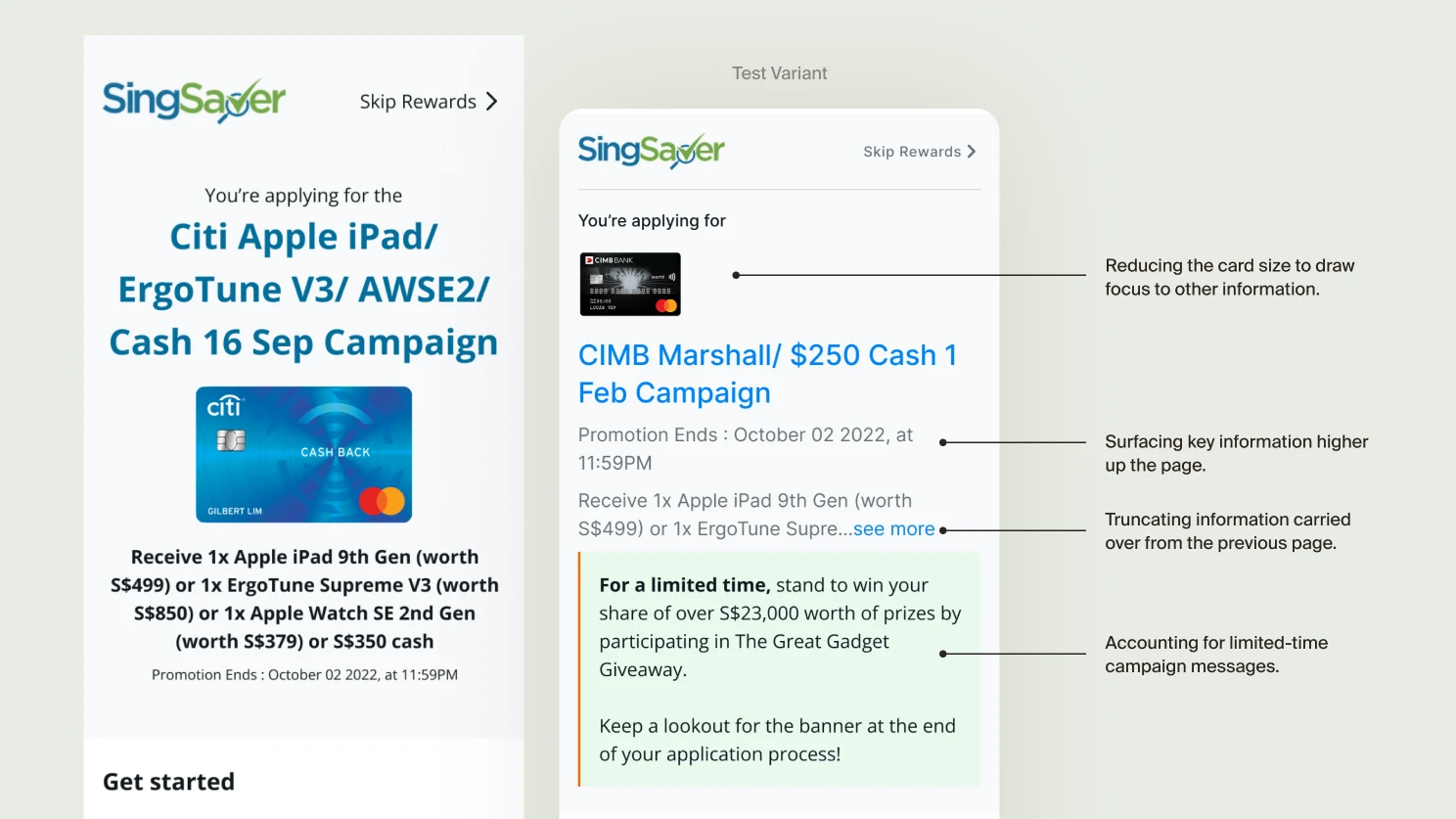

Reducing design clutter and introducing better hierarchy
A bulk of the rework and evaluation draws back to how the information is being portrayed on a mobile screen. As campaigns get bigger and prices are bigger, we are limited to display.
WhySeparating progression from spending mirrors familiar industry loyalty models, keeps the system sustainable at any user volume, and gives users a recognisable mental model.

Showing the right information at the right time
The original design of the form displayed all the steps upfront. The process to submit a redemption for their application of a financial product to get a reward is actually quite complicated. A user typically has to submit an email then continue their application via the bank site and copy their application registration number and come back to MHG site to paste it. The form to paste the ARN is also on another link.
Offering a way to reopen missed links
Users who lost their continuation link had no obvious recovery path. Surfacing a way to reopen the journey kept warm leads warm rather than sending them back to the start.
The successes of the A/B test variant have also allowed us to garner more resources and expand the project to a full fledge revamp of the application journey. The goal remains the same as we focus on driving leads and reduce drop off for applications.

Multi-option login
Offered email and social sign-in side by side, with the dominant option surfaced per market. Removed friction at the highest-dropoff step of the funnel.
WhyLogin was the first place users hit a wall. Lowering that wall lifts every downstream metric.
Clear next steps
With real monetary value at stake, users feared mis-steps in the application flow. We made each next step explicit so users always knew what was expected and what came next. Framed the action language as outcomes ("Continue to bank", "Paste your application number") rather than generic CTAs.
WhyFriction in the wrong place hurts. Specificity in the right place reassures.
Proper form experience
Rebuilt the form with inline validation, clear required-field signals, and contextual help text on the fields users tripped on most often. Fewer error states, fewer dead ends.

Managing expectations while waiting
Submitting an application is the start, not the end. Designed waiting states that explained what was happening, when to expect the next update, and what users could do in the meantime.
Sometimes designing experiences doesn't mean a big revamp. Simple A/B testing by rearranging layouts and copywriting can have strong impact too.

