01: The Making
How this site started
I knew two things going in.
First, after years of designing for various companies and watching AI generate sites on demand, the web is starting to drown in slop. I wanted a site that showed intention behind every decision and every pixel.
Second, having sat on the hiring side of the table, I know a portfolio that stands out gets attention fast. Picture screening 100+ applicants in one sitting. By the tenth tab, it is pure visual fatigue.
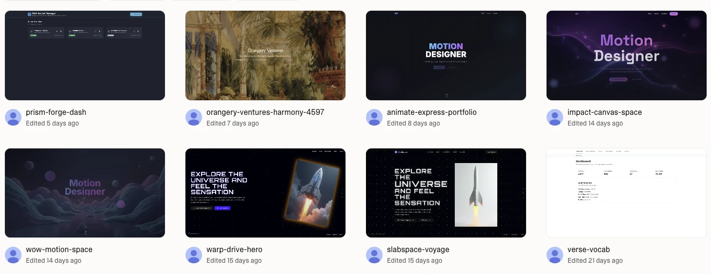
So I went back to what represents me, an editorial site. My design language has always started in book design, where grid, typography, flow, and the relationship between image and content do most of the heavy lifting. The chatbot sits on top of that foundation, as the builder side of me that keeps tinkering with new tools.
How I designed and built it
01 — The paper and grid system
The background is an off-white, closer to recycled or uncoated paper than pure FFF. Print is rarely pure white, and the site shouldn’t be either.
I designed the whole thing in Figma on a proper 12-column grid with variables wired up. The variable system is intentionally lean for a portfolio of this size. Colours stay close to how paper looks and how ink sits on it. I kept the component system minimal too. Once the basics were in place, I connected the Figma MCP and let Claude Code translate the variables and guidelines into the codebase. Before that, Claude had already scaffolded the Astro project with Tailwind set up as the default.
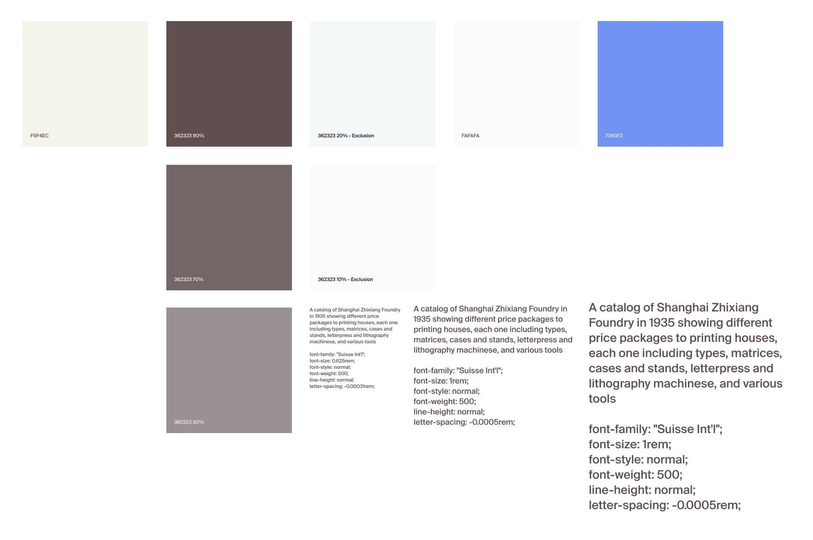
The type is a classic sans-serif, Suisse Int’l, set on generous margins. A small homage to the International Typographic Style I keep coming back to.
02 — The ribbon
Most navigation menus default to a hamburger or a word in the corner. I wanted to try something different. Older books have a fabric ribbon attached to the spine that marks where you stopped reading. On the site, that became a small fixed element on every page, expanding into the full menu on click. With so little else competing for attention, a single line down the middle of the screen is enough to draw the eye.
03 — The colophon
Sits at the bottom of the home page, crediting the typeface, the tools, and the people I borrowed from. Designers love a colophon (:
04 — The ghost effect
This was the hardest move to pull off, even though it is trivial in Figma. Claude’s solution was a duplicate component that renders the next page’s actual content into the current view. So what you are seeing is a real-time render of the next page, behaving the way ink behaves on thin paper. Every page bleeds into the next one. Technically, it is the next page’s content rendered at five percent opacity, mirrored, and sat behind the current view.
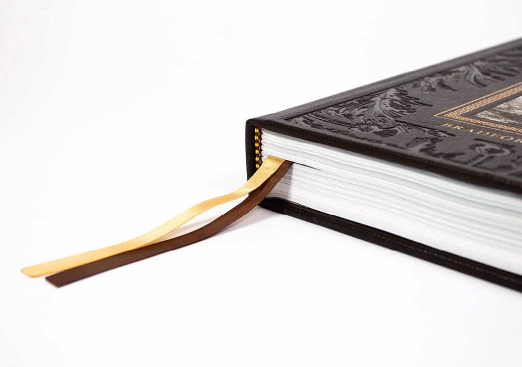
05 — The insert
My resume overlays on top of whatever page you are on, the way a different paper stock gets slipped between pages in a book to mark something important. The PDF is still there to download for people who prefer it.
06 — The chatbot
This started as a quick experiment. I wanted a way to bottle up my thinking into one surface. We are deep in the era of personal compute now, so the question I asked myself was: what if there was a mini version of me that could talk shop about design with anyone who landed on the site? I went back to Claude to figure out the setup, with my usual caveat. If it can run free, I am not going to pay for it. I had also been wanting to play with Google Gemma since release, and this felt like the right excuse.
The boundaries I set for myself:
- 15 chat bubbles per session. Enough to have a real conversation, few enough to deter spam and brute-force prompting.
- Free to run. Cloudflare Workers AI was the obvious choice.
- Cached prompts. I get to see what people are curious about, so please don’t do anything funny. I am watching 👀.
- Hard guardrails. No code support, no homework, no off-topic asks. I’ve seen those cases. ohgawd.
Getting it up and running was easier than I expected. The whole thing pivots on a single about-me markdown file that Gemma treats as a living script.
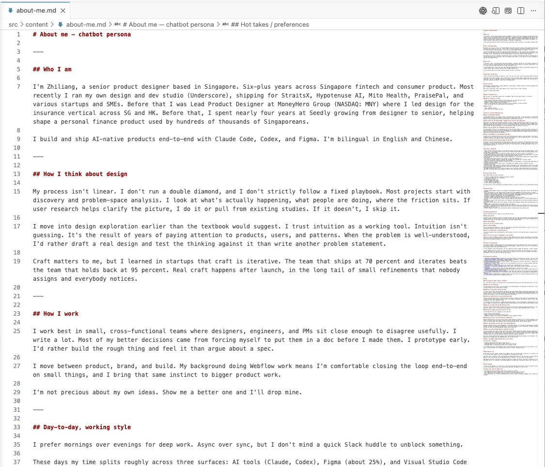
The doc is split into hot takes, stories, FAQs, principles, and things I have changed my mind on. Anyone hiring me would eventually want this kind of substance anyway. Writing it for the bot is just doing the work earlier.
The model and the cost
- Cloudflare Workers AI, Gemma 4 26B
- 256K context window
- ~0.1 Neurons per round-trip
- Free tier: 10,000 Neurons per day, roughly 90,000 conversations
- Spent to date: $0
One thing that reminds me of how AI may not always be the fastest way to solve problem was when I experience a latency of 8s between outputs and response. To reduce the ‘waiting time’, Claude suggested switching to streaming to mask the delay, but streaming would have complicated the implementation and potentially pushed me off the free tier. A simple loading state did the same job by reducing the wait psychologically. How good is that with a small but useful reminder of how foundational UX still is.
What I used to refine the site
The site was only designed for desktop in Figma. I never drew the mobile version. A lot of the later decisions happened directly in Claude Code rather than back in Figma, and the design file barely changed across the week I spent on the build. The rest came together with:
Claude, for code and layout. Component refactors, responsive logic, mobile optimisation, grid placement, copy polish on UI strings. I direct, it executes. The iteration stays with me.
VS Code for editing. Fast file navigation, inline edits, the kind of work where bouncing between Finder, an editor, and a browser would have eaten the day.
A few small refinements that paid off out of proportion to the effort:
- Blend modes for image treatment**, which let me sit imagery on the off-white paper colour without recolouring each asset by hand.
- Mobile optimisation by Claude.** Editorial layouts behave roughly identically across mobile sites. There was little point engineering it manually.
- AI-assisted image placement** on the works pages. Faster than dragging each asset into the right column.
The tools used
- Framework: Astro
- Design: Figma, Figma MCP
- Hosting: Cloudflare Pages
- Source control: GitHub, auto-deploy on push
- Chatbot model: Cloudflare Workers AI, Gemma 4 26B
- AI in the build process: Claude for code, layout, and refactoring. VS Code as the editor.
- Cost: $ in tokens
This is a small slice of what designers can ship on their own now. Three things I take from the build.
- Building with AI is less delegating, more directing. The taste stays with me. The labour goes to the model.
- Delegate or direct out the parts of the design process you don’t enjoy. That is where AI earns its keep.
- Know when to skip it entirely. Sometimes you don’t need AI to edit a simple piece of code. You just need to do it yourself, and ask once if you get stuck.
Building this site was a good reminder that designs come with intention and every decision matters more than ever now in this AI space we’re in.
—
I am currently on the lookout for my next role. Do connect on LinkedIn or reach out to me at zhiliang.work@gmail.com if opportunities arise.